Elinkeinoelämän keskusliitto EK
The Confederation of Finnish Industries
The Confederation of Finnish Industries (EK) is the voice of Finland’s business life. It brings out the views of Finnish businesses and supports Finland’s renewal and growth.
The Confederation of Finnish Industries strives to influence Finnish society through its members, Finnish companies. It shares information and engages in discussions. It has an agenda: to ensure that the views of its member companies are taken into account in decision-making as much as possible.
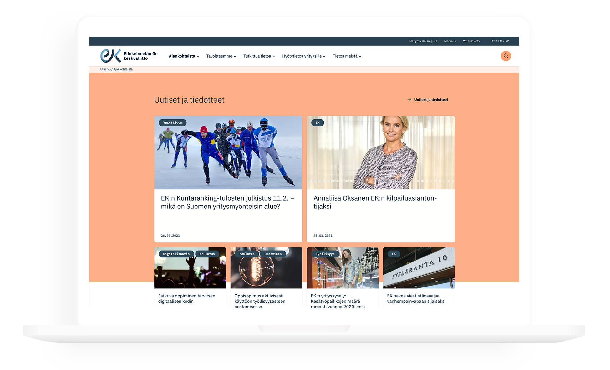
The Ek.fi website brings together the union’s policies, strategy and messages.

1
The starting point
The EK.fi website was outdated in many ways. The content was not clearly structured, the main messages were buried under other content and the visuals were outdated. A large amount of content posed challenges for users, as finding the right information was difficult. Usability had also decreased in terms of maintenance, as content production was unnecessarily complicated and time-consuming.
The content was mostly presented in a static text format, which is not the most attractive, let alone the fastest way to make it understood. EK communicates about current topics and phenomena, and highlighting these was important in order to keep the site relevant to the user at all times.

2
Strategy
EK’s website aims to be Europe’s best influencer site, reaching out to decision-makers, the media, and member companies through relevant and interesting content. The site provides financial data in an easy-to-consume format. The website now provides tools for EK to present the latest research results and data of interest to its target groups.
EK wants to be a stronger social influencer. The new brand identity emphasizes modern influencer communication and the website makes sure that the brand is visible to the public.

3
Implementation
The implementation of the new EK.fi website began with a thorough inspection of the old website. Based on data and workshops, we identified which content was popular and functional, and which did not work well.
Based on the results, we built wireframe models and a sitemap. The client was strongly involved in the design of the wireframes, which helped us prioritize the needs of the target groups at the design stage. The new brand look and layouts emphasize EK’s expertise, but also its approachability and playfulness.
With the help of wireframes, we carried out a user survey in which users from different target groups tested user paths corresponding to their own needs with a clickable prototype.
We chose WordPress as the website’s content management system because of its great content management features and easy customization. The site does not consist of traditional page templates but is based on a modern block structure. Each page is built from individual blocks that can contain a wide variety of different text, image, and video content. Blocks give content producers the tools to create diverse and compelling content effortlessly without compromising the brand’s visuals.

5
Data visualization
One of the most interesting types of content on the EK website is a large amount of financial data from different decades.
In order to present the data to visitors, a separate concept of the Economic snapshot was created, through which the most important indicators of the Finnish economy can be easily seen on one page. For more detailed economic data, the different data were divided into their own subject areas under Information about the Finnish economy.
A strong use of typography and a new color palette were utilized when visualizing the data. Dynamic graphs communicate the results very clearly and reliably with EK’s identity.

6
Results
The results speak for themselves: the site’s usability seems to have improved by many different metrics. Visitors stay on the site longer than before, load more pages during their visit and also stay on one page longer. The share of immediate exits from the site has also decreased. Because the design and implementation emphasized highlighting current important topics, EK.fi is now relevant to the user at every stage and makes its visitors immerse themselves deeper into the content.
When comparing the period 6.10.2020 (publishing date) – 10.12.2020 with the same period in the previous year, the number of visitors increased by 6.10% and the number of pages per visit by 4.64%. Expert articles collected more than 16 thousand page views, which is +189% more than in the previous year. On the new website, expert articles are easier to find and the site’s usability has improved, which makes users more engaged than before. The average duration of visits increased by more than 44%, which also indicates better usability than before. The exit rate from 6 November to 10 December 2020 decreased by almost 9% compared to the same period of the previous year.
Key figures
+6,10 %
More visitors
+4,64 %
Pages per visit
+189 %
Page views on expert articles
+44 %
Average visit duration
-9 %
Exit rate
The team
Brand and identity
Miltton
Tiina Kiesiläinen
Olli Sirén
Inka Myllysilta
Pauli Kervinen
Jesper Vuori
Pia Alfthan
Logo:
Antero Nuutinen
Website design and implementation
Evermade
Riikka Pakarinen
Tuomas Velling
Sauli Puukangas
Kirsi Maijala
Timo Sundvik
Vilma Järvinen
Joonas Savolainen
Client
The Confederation of Finnish Industries
Teemu Lindfors
Riina Kasurinen
Mari Haavisto


